Did you know that colors have personality? Orange is energizing, blue is calming. Red is daring, purple is regal. Colors affect us both mentally and physically, so it’s no wonder that selecting colors for your home is difficult.
I carry a color wheel in my design bag to share with my clients, particularly those who are frustrated with color. Understanding how to pull color combinations from the wheel often gives my clients awesome color confidence!
THE COLOR WHEEL
A designer’s tool….available in craft or art stores.
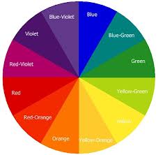
PRIMARY, SECONDARY, & TERTIARY COLORS
Primary colors = red, blue and yellow. All colors are created from primary colors.
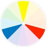
Secondary colors = violet (red and blue), green (blue and yellow) or orange (red and yellow). Created by mixing equal amounts of two primary colors.
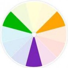
Tertiary colors = red-violet, blue-green. Created by mixing one primary color with larger amounts of another primary color.

Voila….the color wheel! The wheel can now be divided in half; warm on the right, cool on the left.
- Warm reds, oranges or yellows are energetic and stimulating. Great for use in active rooms.
- Cool blues, greens or purples soothe and calm. Perfect for rooms that require rejuvenation and/or rest.
- White and black are neutrals, mixed with any color to achieve tints or shades.
So now you have color knowledge…..how do you use it to create color combinations?
ACHIEVING COLOR CONFIDENCE
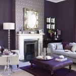
1. Monochromatic Colors
All paint swatch cards have different values of the same color (i.e. monochromatic colors). Using monochromatic color creates a sophisticated and uncomplicated look.
 |
 |
 |
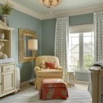
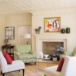
2. Complementary Colors
Complementary colors are opposites (i.e. red/green, yellow/violet). These high-contrast color schemes are tricky. For best results, allow one color to dominate while the other color remains subtle.
 |
 |
 |
3. Analogous Colors
Analogous colors are next to each other. This combo usually creates a serene room. Use one color as dominant, the second color as support and the third color as an accent.
 |
 |
 |
4. Triadic Colors
Triadic colors are evenly spaced. These combos are bright, so let one color dominate and the other two colors accent.
 |
 |
 |
Tips for Choosing a Color Scheme
- Don’t worry too much about current trends. I always just pick colors I like best!
- Create a color plan. Pull fabrics, color swatches, wallpapers, etc. and lay them out together on a white board. Mix in different colors and see what is most visually appealing.
- Pick two core colors (one dominant, one secondary) and two to three patterns for the room. You can add accent colors, but don’t go overboard. Too many colors and/or patterns create chaos.
- Color continuity between rooms is pleasing, especially if you have an open concept home. Your rooms don’t have to be the same color, but creating a harmonious flow between rooms will impact the overall appeal.
- Using a favorite fabric? Simply match both light and dark tones of the same color to the fabric.
- Vary color values in rooms. For instance, use light color for walls, medium color for floors or furniture, and dark color for accents. You never want to use the same value (i.e. saturation) for each color.
Next time you’re feeling overwhelmed with color, grab a color wheel and spend some time developing a plan for your room. I guarantee with a little practice you’ll be a color genius!
Written by:
Cecilia Staniec
InteriorDesigner & Stager, adarlingroom.com


